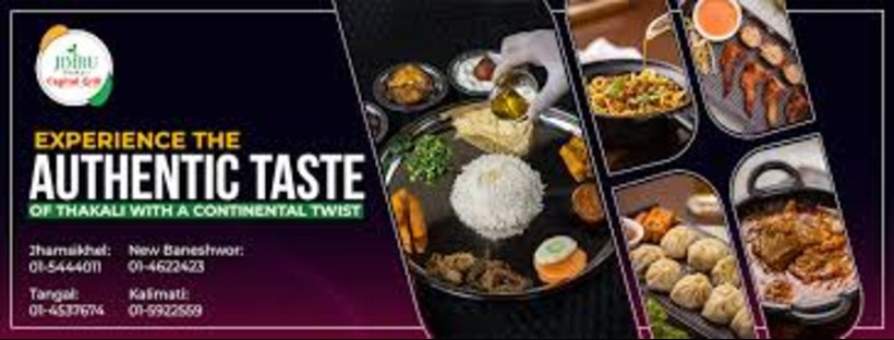
Hey foodies and fellow design enthusiasts! As a graphic designer, I often get the pleasure of helping local businesses shine. Today, I’m taking you behind the scenes of creating a vibrant ad for Jimbu, our fantastic local restaurant (and trust me, their momos are legendary!). We’ll be using the ever-accessible and powerful tool, Canva. So, grab a virtual apron, and let’s get cooking!
Step 1: Understanding the Flavor Profile – The Brief
Before even opening Canva, the most crucial step is understanding Jimbu’s brand and the goal of this specific ad. Are we promoting a lunch special? Highlighting their cozy ambiance? Announcing a new dish?
For this example, let’s say Jimbu wants to create an Instagram post showcasing their popular “Thali Set” to attract more lunchtime customers. Key elements to consider are:
- Target Audience: Local food lovers, office workers looking for a satisfying lunch.
- Key Message: Delicious and authentic Thali Set available for lunch.
- Brand Personality: Warm, inviting, authentic, slightly rustic.
- Platform: Instagram post (square format).
- Call to Action (Implied): Visit Jimbu for lunch.
Step 2: Gathering the Ingredients – Visual Assets
Great food photography is the soul of a restaurant ad. Ideally, Jimbu would provide high-quality, well-lit photos of their Thali Set. Think vibrant colors, appealing textures, and a focus on the delicious details.
If professional photos aren’t available, we can explore high-quality stock photos on Canva or other platforms, ensuring they align with Jimbu’s food style. However, authentic, restaurant-specific imagery always resonates best.
Step 3: Setting the Table – Canva Setup
Now, let’s fire up Canva!
- Create a Design: Click the “Create a design” button in the top right corner.
- Choose Dimensions: Select “Instagram Post (Square)” for our target platform. This ensures the ad is perfectly sized for the feed.
- Name Your Design: Give it a descriptive name like “Jimbu Thali Lunch Ad” to keep things organized.
Step 4: Plating the Dish – Layout and Composition
This is where the design magic happens. We want a visually appealing and informative layout.
- Background: Instead of a plain white background, let’s consider something that complements Jimbu’s brand. Perhaps a slightly textured background in a warm, earthy tone, or even a subtly blurred image of their restaurant’s interior.
- Focal Point: The star of the show is the Thali Set photo. We’ll place it prominently in the design, allowing it to take center stage. Consider using a full bleed image or framing it with a subtle border.
- Text Elements:
- Restaurant Name: “Jimbu” should be clearly visible, perhaps in a stylish yet legible font that reflects their brand.
- Headline: Something enticing like “Lunch Just Got Delicious!” or “Savor Our Authentic Thali Set.” Keep it concise and impactful.
- Brief Description (Optional): A short line highlighting key features or ingredients.
- Call to Action (Subtle): We can subtly include “Visit Us Today!” or their location if space permits.
- Visual Accents: To add visual interest without cluttering the design:
- Color Palette: Choose colors that align with Jimbu’s branding. Perhaps warm reds, earthy browns, or vibrant greens if they use fresh herbs prominently. Canva offers pre-made color palettes or allows you to create your own.
- Shapes and Lines: Use subtle shapes or lines to frame elements or create visual separation.
- Icons (Optional): A small location pin icon or a subtle food-related graphic could be used sparingly.

Step 5: Adding the Secret Spice – Typography and Branding
Fonts play a crucial role in conveying a brand’s personality.
- Font Selection: Choose 1-2 complementary fonts. One for the headline (that’s attention-grabbing) and another for the body text (that’s easy to read). Canva has a vast library of fonts. For Jimbu, we might consider a slightly rustic serif font for the headline and a clean sans-serif for the body.
- Hierarchy: Use different font sizes and weights to create a visual hierarchy, making the most important information stand out.
- Color Consistency: Ensure the text colors work well with the background and image, maintaining good contrast for readability. Use Jimbu’s brand colors if they have established them.
Step 6: The Final Garnish – Review and Refine
Before hitting that “Download” button, it’s essential to review and refine the design.
- Visual Balance: Does the layout feel balanced? Are elements evenly distributed?
- Readability: Is the text easy to read on a small screen?
- Clarity of Message: Is the key message immediately clear?
- Brand Consistency: Does the ad reflect Jimbu’s overall brand and style?
- Mobile View: Preview the design on a mobile device to ensure it looks good where most people will see it.
Step 7: Serving it Up – Exporting and Sharing
Once we’re happy with the design:
- Download: Click the “Share” button in the top right corner and then “Download.” For Instagram, a high-quality JPG or PNG format is recommended.
- Sharing: Jimbu can then easily upload this eye-catching ad to their Instagram feed, along with a compelling caption and relevant hashtags.
The Takeaway
Creating effective ad visuals doesn’t require complex software. Canva empowers us to design professional-looking graphics with its user-friendly interface and vast library of resources. By following these steps, keeping the client’s brand in mind, and focusing on clear communication, we can help local gems like Jimbu attract more customers and spice up their online presence!
What are your favorite Canva design tips? Share them in the comments below!
